The new decade got off to a great start in 2010 with fresh styles in the web design arena. With the emergence of the new CSS3 and HTML5, designers and developers had a whole new set of cool effects and tools at their disposal. From textured backgrounds, drop shadows, rounded corners, RGBA transparency, to modal boxes designers came up with a set of new design trends that took us nicely into 2010.
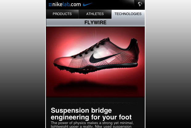
With the surge of new technology in smart phones we will also see mobile websites become a big thing, perhaps to wrap up 2010 with some cool websites mirrored into mobile web trends. But for now we will focus on the web design area, as there are many great new trends that are creating a new fresh look for us to explore.
Big Headers, Introductions and Huge Images
As the title suggests this section looks at the trend of big header areas, big introductions and huge images! Here people use the top fold of the browser to wow you with a statement about them, or a header image – much like a splash page, but they are so 2009! With the ease of bigger screen resolutions web designers are giving more room to growing header widths and utilizing this area for some great product or illustration showcasing.
The main focus with the big header spotlight is for brand exposure and to get that first message in. This keeps the viewer browsing through out the site.


Rich Texturized Backgrounds
The emergence of richer interfaces has introduced some interesting textures to the web-space. Using textures creates some great depth and with the right elements this trend is growing for those that want more pop to their website.
Here the main focus is creating depth and to give a unique touch to the overall look and feel of the website.


Sleek, Eye-Popping Icons!
Sites are now incorporating icon based navigations more and more. With the range of premium stock icons at a low price, people are including them for a richer user experience. These little (or sometimes big!) icons can create a great way to explore and understand the meaning that the website is trying to convey. We all know that most of us will skim large areas of text, sometimes even missing the point to a piece of text, and so icons are a great way to break down concepts that might have otherwise been bland without some visual cue. We see the emergence of icons used heavily in feature rich companies and services/product based websites.
Now the main focus of these awesome icons is to make the focus point of the text more easily conveyed and also creates a rich navigation source for the person browsing.


Full Screen Background Images and Videos
In 2010 trends are bigger and better, and I mean literally! Here the use of full screen images and video give the user an immersive experience with the image eating up the content of the site. This trend of 2010 is related to the fact that screen resolutions are getting bigger and better. With these better screens websites can display ideas and actions and demonstrate a point in bigger images and video. Full screen video especially will be able to interact and engage with the user, immersing them in the website. A good example is Futuretainment by Mike Walsh. His website conveys and immerses the users and coupled with the easy navigation makes for a unique user experience.
The main focus here is engaging the user in a unique way, immersing them in the image or video to create a rich experience.


Typography Based Websites
Fresh in 2010 typography only websites give us a new light on creating website layouts. With the emergence of technologies such as Typekit, sFIR and Cufon which uses Javascript and Flash, a designer can embed some typography richness to the site. Another technology is HTML5’s method of uploading a font to the web server and if the user is lacking the font then HTML5 will automatically have them download it.
The days of Arial, Tahoma and Verdana are over; web safe fonts move aside! With such tools at our disposal, typography rich sites are going to embrace new ideas and approaches to web design. With the use of huge fonts, letterpress type and font replacement methods, typography layouts are coming out in full swing, but can it last? And with it create new inspiring ways for users to experience the web. With strong use of grid based designs bordering on magazine layouts, typography has a whole new playground to explore in the web for creating great user experiences.
What is the focus of typography in web? Well, it’s creating a new outlook, fresh design and an experimental new canvas to explore the web and create some unique user experiences.


Other Cool Trends Coming Your Way…
Modal boxes/light boxes – Great ways to keep the user on the same page, basically replacing those annoying pop-up windows, but so much better! Triggered by a user action they are a great way to bring up extra information that serves to enhance the user experience.

 Grid Based Web Design
 – Grids are the new canvas. Here we will see more and more websites being driven by grids, with clean easy to view layouts, grids will shape the sites to come.

 Carousels
 – Originally used for just images, these nifty carousels are now being used in for much more! Breaking out of tradition, people using carousels are able to integrate information, videos, and images in a more creative way.

 Ribbons, Retro, Handwriting and Watercolor
 – How many sites out there have you seen using one of these elements? Ribbons that break out of the normal navigation and create a depth for the user are being used much more frequently. As is handwriting elements, typography or illustrations integrated into the interface giving it a nice personal touch. Watercolor splashes here and there, from backgrounds to navigations to adding texture to the page, watercolors’ are here in 2010, but will they still be big at the end of the year amongst all the other competition?


 Mobile Website Designs
 – Starting to become something big, mobile websites are emerging as a whole new playground for people to design new exciting layouts on. With a smaller interface and different set of users controls (swiping for touch screens), designers are faced with not only the prospect of designing an intuitive website but a mobile site as well.
 What do you think?
 – Any trends or strong recurring themes in the current state of web design that we missed? Please let us know in the comments below!
 The new decade got off to a great start in 2010 with fresh styles in the web design arena. With the emergence of the new CSS3 and HTML5, designers and developers had a whole new set of cool effects and tools at their disposal. From textured backgrounds, drop shadows, rounded corners, RGBA transparency, to modal boxes designers came up with a set of new design trends that took us nicely into 2010.
With the surge of new technology in smart phones we will also see mobile websites become a big thing, perhaps to wrap up 2010 with some cool websites mirrored into mobile web trends. But for now we will focus on the web design area, as there are many great new trends that are creating a new fresh look for us to explore.


 Grid Based Web Design – Grids are the new canvas. Here we will see more and more websites being driven by grids, with clean easy to view layouts, grids will shape the sites to come.

 Carousels – Originally used for just images, these nifty carousels are now being used in for much more! Breaking out of tradition, people using carousels are able to integrate information, videos, and images in a more creative way.

 Ribbons, Retro, Handwriting and Watercolor – How many sites out there have you seen using one of these elements? Ribbons that break out of the normal navigation and create a depth for the user are being used much more frequently. As is handwriting elements, typography or illustrations integrated into the interface giving it a nice personal touch. Watercolor splashes here and there, from backgrounds to navigations to adding texture to the page, watercolors’ are here in 2010, but will they still be big at the end of the year amongst all the other competition?


 Mobile Website Designs – Starting to become something big, mobile websites are emerging as a whole new playground for people to design new exciting layouts on. With a smaller interface and different set of users controls (swiping for touch screens), designers are faced with not only the prospect of designing an intuitive website but a mobile site as well.
 What do you think? – Any trends or strong recurring themes in the current state of web design that we missed? Please let us know in the comments below!