How to Turn Your Boring Type Into a More Interesting Art Piece: Part Two
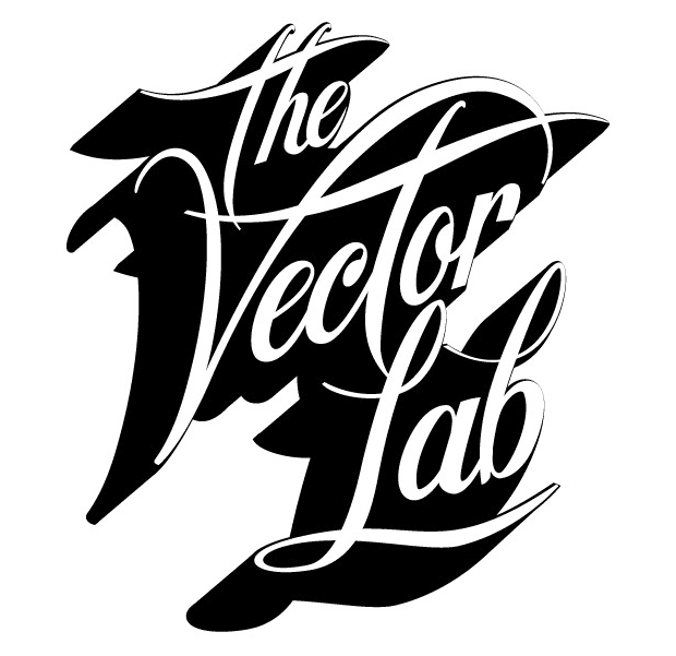
And now, the much anticipated Part Two of the tutorial for turning some static type into a more interesting art piece! If by unfortunate chance you missed Part One, it is on the Vecteezy Blog! Once again, for this tutorial, you will need: Adobe Illustrator, Adobe Phtotoshop, an ink jet printer, printer paper, a scanner, and a cup of water. A hair dryer will also help speed things up. Here is where we were when we left off:
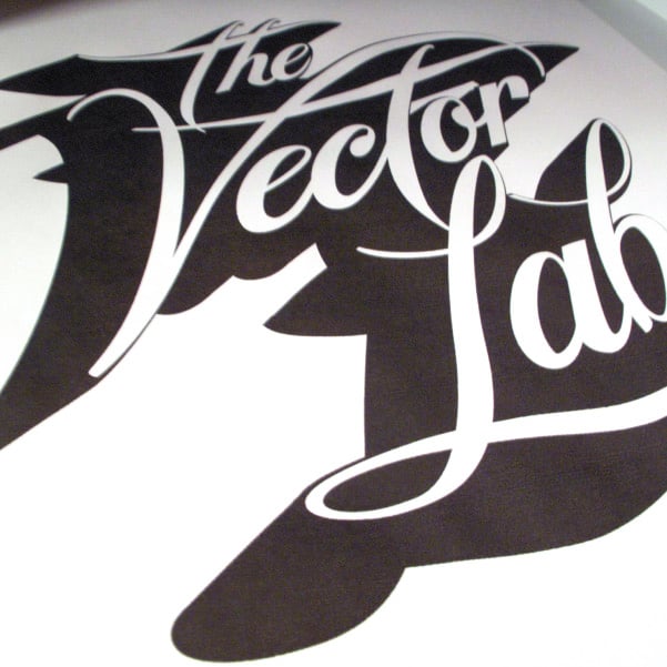 Now that you are living life on the edge, it’s time to get your hands dirty. Literally. Before the ink on your printout dries, go over to your sink and drip some water on it.
 Smear the ink around with your fingers and let it drip and run all over the place. The more thrashed it looks, the more interesting your piece will be. Get a hair dryer and dry off your new creation. You can even use the hair dryer to move the ink around as it dries for some cool effects.
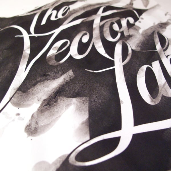
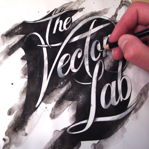
 Once the paper is dry, you can go back in and enhance areas with a pencil. I really like to use a black Prismacolor pencil for shading and a white Prismacolor for highlights. These pencils let you lay down a lot of color and good gradients. Here you will notice that I added in shadows where the type loops over top of itself to give more dimension to the piece. Next, you are ready to scan your image back into the computer.
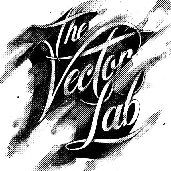
 In Photoshop, change the image to grayscale mode. Then go to Image>>Mode>>Bitmap and select Halftone as your Method. Here I chose a round halftone pattern. You can experiment around to see what you like best.
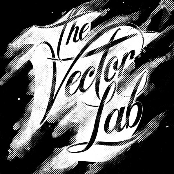
 I didn’t like the round halftone pattern, so I went back and chose ‘Line’ as my halftone method. I was pretty stoked and settled on this look.
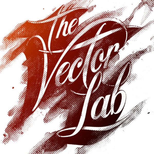
 I have a little trick for quickly putting gradient color into bitmap images like this. Still in Photoshop, I went to Image>>Adjustments>>Invert to flip out the black and white areas. I saved it as a bitmap Tiff image and placed it back into Illustrator. When you place a bitmap tiff into Illustrator, everything that is white in the image shows up transparent. And you can assign anything that is black to be any color you choose. So I selected the image and assigned it to the color white. So it basically becomes a white ‘mask’ with transparency. I then placed an orange-red gradient vector square behind the bitmap and the result is what you see below.
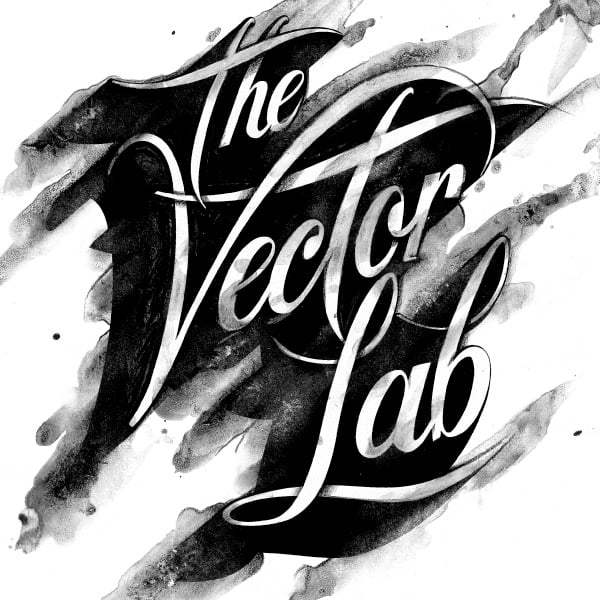
 I hope you dig it.
-Ray
I hope you dig it.
-Ray
Part Two
Now to begin part two, print out your typography using your inkjet printer. Notice how the paper feeds into your printer. Pick up your printout and feed it through your printer the same way three or four more times. The point is to get the ink really saturated on the paper. I use a pretty standard HP Officejet Pro L7580, but any inkjet should work fine. I’ve never had a problem re-feeding the same printout multiple times, but here’s my disclaimer: **Do this at your own risk!!! Hopefully it won’t screw up your printer with paper jams, etc.**
Now that you are living life on the edge, it’s time to get your hands dirty. Literally. Before the ink on your printout dries, go over to your sink and drip some water on it.
Smear the ink around with your fingers and let it drip and run all over the place. The more thrashed it looks, the more interesting your piece will be. Get a hair dryer and dry off your new creation. You can even use the hair dryer to move the ink around as it dries for some cool effects.
Once the paper is dry, you can go back in and enhance areas with a pencil. I really like to use a black Prismacolor pencil for shading and a white Prismacolor for highlights. These pencils let you lay down a lot of color and good gradients. Here you will notice that I added in shadows where the type loops over top of itself to give more dimension to the piece. Next, you are ready to scan your image back into the computer.
In Photoshop, change the image to grayscale mode. Then go to Image>>Mode>>Bitmap and select Halftone as your Method. Here I chose a round halftone pattern. You can experiment around to see what you like best.
I didn’t like the round halftone pattern, so I went back and chose ‘Line’ as my halftone method. I was pretty stoked and settled on this look.
I have a little trick for quickly putting gradient color into bitmap images like this. Still in Photoshop, I went to Image>>Adjustments>>Invert to flip out the black and white areas. I saved it as a bitmap Tiff image and placed it back into Illustrator. When you place a bitmap tiff into Illustrator, everything that is white in the image shows up transparent. And you can assign anything that is black to be any color you choose. So I selected the image and assigned it to the color white. So it basically becomes a white ‘mask’ with transparency. I then placed an orange-red gradient vector square behind the bitmap and the result is what you see below.
I hope you dig it.
-Ray

About the Author
Ray Dombroski is a Graphic Designer and the founder of TheVectorLab, a California based design website that features high quality vector stock art geared towards professional graphic designers. Ray has worked in the surf apparel industry for companies such as: Billabong, Op/Ocean Pacific, Quiksilver, Globe, Body Glove, and many other well-known brands.